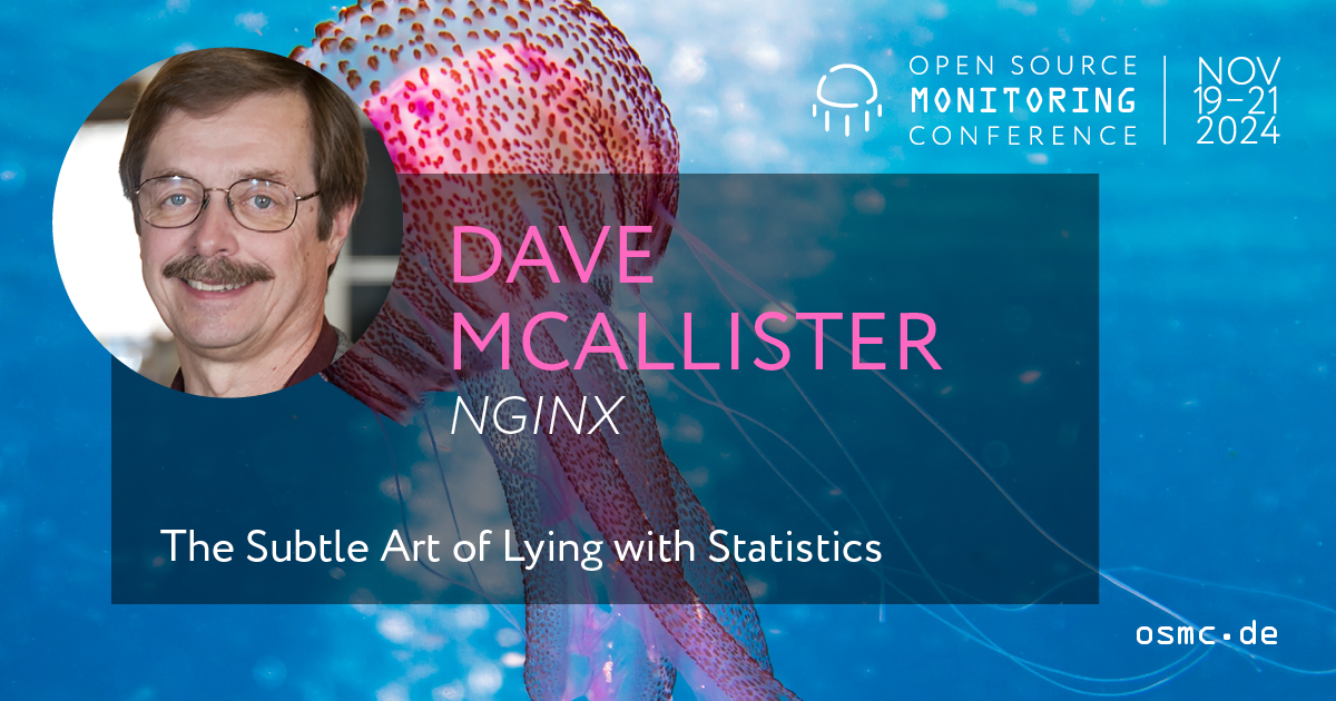
When Numbers Tell Tales: A Personal Take on Dave McAllister’s Talk
Have you ever read a headline claiming that „90% of users prefer this tool“ and thought, “Wait, who are these users?” That’s exactly the kind of question Dave McAllister wants you to ask.
At OSMC 2024, Dave—Senior Open Source Technologist at NGINX—took the stage with a presentation that felt more like a wake-up call than a lecture: „The Subtle Art of Misleading with Statistics.“
As a trainee in IT Specialist for Data and Process Analysis, I found this talk eye-opening, engaging, and surprisingly funny. Here’s what I took away—and why it matters.
Story First: How Misleading Stats Can Change the Narrative
Imagine you’re part of a DevOps team evaluating a new deployment tool. You’re given survey results that claim „95% of engineers found it beneficial.“ Impressive, right?
Now imagine that only 20 engineers were surveyed—and all of them were the tool’s early adopters. The other 180 engineers weren’t even asked.
That’s not a lie—it’s just a well-framed statistic. And it’s dangerous.
Dave walked us through several real-world scenarios where data told very different stories depending on how it was sliced. And he showed us how to spot it.
A Few Clever Ways Stats Can Lie
1. The „Average Trap“
Claim: The average income per person in the U.S. is $59,384. Household size is 2.63 people. Therefore, average household income must be $156,179.
Reality: That’s not how it works.
→ Lesson: Always ask which average is being used—mean, median, or mode—and whether it makes sense.
2. Correlation ≠ Causation
When incidents increase alongside the number of automation scripts, does that mean automation causes failures?
Maybe. Maybe not.
Dave reminded us that there could be hidden variables, such as increasing system complexity or a lack of testing. The key takeaway is that just because two trends move together doesn’t mean one causes the other.
→ Lesson: Be skeptical. Just because two things move together doesn’t mean one causes the other.
3. Graph Crimes
From shrinking the y-axis to cherry-picking time frames, graphs are some of the most effective ways to mislead—because they look objective. For example, a performance improvement of 1% can appear monumental if the y-axis is zoomed in. He advised always inspecting axes, scales, and omitted data before trusting a graph.
→ Lesson: Always check the scales, baselines, and what’s left out.
4. Survey Bias
Surveys can be powerful tools, but their design can lead to biased results. That said, he pointed out that many surveys are crafted to confirm preconceived conclusions. For instance, asking, „How much do you love our new software update?“ assumes the user loves the update. A more neutral question would be, „How would you rate our software update?“
Sounds harmless, right? But the survey only went to engineers who already liked the tool.
→ Lesson: check if survey questions are leading or if respondents are cherry-picked.self-selection, leading questions, and framing that’s too positive.
5. P-Hacking and Data Dredging
analysts sift through large datasets until they find random correlations. Citing Tyler Vigen’s „Spurious Correlations,“ :
“Per capita cheese consumption correlates with deaths by bedsheet entanglement.”
He humorously showed how cheese consumption correlates with bedsheet tangling deaths—purely by coincidence. The key point is that if you look long enough, you can find data to support any claim.
→ Lesson: Always start with a hypothesis, not with the goal of proving something.
My Personal Takeaway
What struck me most is how easy it is to be misled—even with good intentions. As someone training to work with data professionally, this talk made me realize how much responsibility we have. Data can inform. It can also manipulate.
The Big Picture
Dave McAllister’s engaging and insightful presentation made it clear that statistics can both inform and mislead. As data professionals, we have an ethical responsibility to use statistics wisely, question misleading claims, and educate others on proper data interpretation can also manipulate.
If you’re curious to dive deeper or want to revisit some of the examples he shared, the slides and a recording of his talk are available online. It’s definitely worth a look!


0 Kommentare